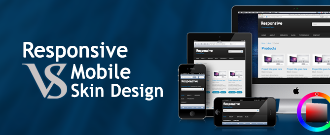
Responsive vs. Mobile Skin Design
One of the most common questions that website owners ask us today is whether they should go for a responsive web design or for a separate mobile skin version of their site. Statistics clearly indicate that the number of mobile visitors is increasing more than 100% every year in the last 3 years, making it impossible for businesses to ignore this segment of the users.
If you still think you don’t have enough mobile visitors to be considering this question, just use Google Analytics to monitor your website traffic trends and see if you can still afford to ignore your site’s mobile visitors. The answer would most definitely be ’No’. So, what would be a good option for you: a responsive site or a separate mobile version? Before you make any decision, here are some facts you should be aware of about both options.
What Is a Responsive Design?
A responsive website design is one where a webpage is designed to re-format itself according to the screen’s dimensions without requiring the page to be reloaded. This means if your website is viewed using multiple devices, the layout will adjust itself to maintain the readability of the page.
What Is a Mobile Skin Design?
Creating a mobile skin design means you would be creating an entirely separate website of your business for mobile devices which is optimized to perform best on small-sized devices. However, it is important that both websites are kept consistent without creating confusion. A separate mobile website definitely improves experience as it is designed with a minimalistic approach. However, if the visitors need additional functionality, they should always be given the option to switch to the desktop site.
Pros and Cons of Responsive vs. Mobile Skin Design
The pros of one design may be the cons of the other when you are comparing responsive with mobile website designs. Before you decide, consider these pros and cons:
Pros of Responsive Design/Cons of Mobile Skin Design
- A responsive design means there will be only a single code that would have to be maintained as these websites are designed on a one-code base. Mobile websites, on the other hand, are designed using a different code base than your original site, so, it enhances the need of higher co-relation, testing between these two websites.
- A responsive design assures that there is a single URL for each page of the website which is good for search engine optimization. A separate mobile skin means you may have to maintain two different URLs. Most of the mobile skins starts with an ‘m’ prefix e.g. m.yourdomain.com. The different URLs affect the SEO optimization of your site negatively or it means you need to be very vigilant for the SEO principles including canonical tags, if left unattended it will surely be hurt. The best news is that some of the smart e-commerce platforms have overcome this drawback like AspDotNetStorefront and Magento both offer a separate mobile skin design without any requirement of a second URL.
- With a responsive design, you won’t have to optimize your website every time a new device with a different screen size is introduced in the market. With mobile websites, you have to handle the optimization every time a new device comes on the market to keep them efficient and functional on that device. This drawback can be overcome by designing a responsive mobile skin!
Pros of Mobile Skin Design/Cons of Responsive Design
- Since mobile designs are created specifically for mobile devices with a simple layout and design, they offer a much better user experience. If your responsive website design is rich due to colors and images, it will take more time to load, affecting your performance.
- Transitioning your website to a responsive design is a daunting and expensive task where you will have to rip and replace your entire site. Compared to that, creating a separate mobile site is much less expensive as you won’t have to redesign your site completely.
- A separate Mobile Skin is easy to maintain in a sense if you do a change in mobile skin, it does not affect the desktop website as code is completely different whereas in case of responsive if you do a change in the desktop version it need to be well tested how it translates into mobile devices.
Verdict
This brings the discussion back to the main question: which option is best? The answer is not so simple though. While it is true that responsive design is the trend but the most curious question is why eBay, Google Shopping, Yahoo are still not responsive but have gone for a separate mobile skin. Interestingly, Amazon is giving its users pleasure of both the worlds – It’s main website is responsive while if you open the Amazon on a mobile device, it returns a separate mobile skin.
So, if you can afford, the ideal solution is both otherwise make a choice on a case by case basis. Make the choice depending on what your mobile visitors are looking for and how that can be delivered to them in the best way possible.


Leave A Comment